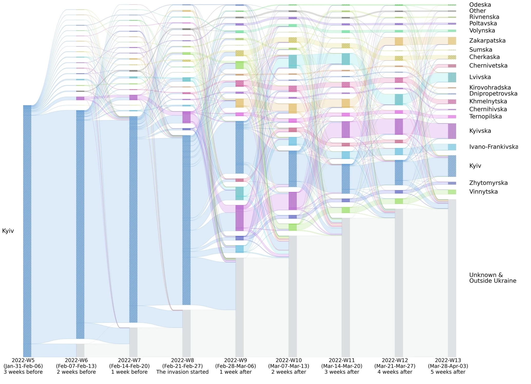
Population migration from Kyiv. Estimated displaced populations flowing from Ukraine’s capital, Kyiv, to other regions. The bar height represents the number of people; the flows to “Unknown and Outside Ukraine” are unclear because the datasets do not cover flows outside Ukraine well. ©2024 Shibuya et al. CC-BY-ND
In times of crisis, effective humanitarian aid depends largely on the fast and efficient allocation of resources and personnel. Accurate data about the locations and movements of affected people in these situations is essential for this. Researchers from the University of Tokyo, working with the World Bank, have produced a framework to analyze and visualize population mobility data, which could help in such cases.
Wars, famines, outbreaks, natural disasters … There are, sadly, many reasons why populations might be forced or feel compelled to leave their homes in search of refuge elsewhere, and these cases continue to grow. that there were over 100 million forcibly displaced people in the world. Over 62 million of these individuals are considered internally displaced people (IDPs), those in particularly vulnerable situations due to being stuck within the borders of their countries, from which they might be trying to flee.
The circumstances that displace populations are inevitably chaotic and certainly, but not exclusively, in cases of conflict, information infrastructure can be impeded. So, authorities and agencies trying to get a handle on crises are often operating with limited data on the people they are trying to help. But the lack of data alone is not the only problem; being able to easily interpret data, so that nonexperts can make effective decisions based on it, is also an issue, especially in rapidly evolving situations where the stakes, and tensions, are high.
“It’s practically impossible to provide aid agencies and others with accurate real time data on affected populations. The available data will often be too fragmented to be useful directly,” said Associate Professor Yuya Shibuya from the Interfaculty Initiative in Information Studies. “There have been many efforts to use GPS data for such things, and in normal situations, it has been shown to be useful to model population behavior. But in times of crisis, patterns of predictability break down and the quality of data decreases. As data scientists, we explore ways to mitigate these problems and have developed a tracking framework for monitoring population movements by studying IDPs displaced in Russia’s invasion of Ukraine in 2022.”
Even though Ukraine has good enough network coverage throughout to acquire GPS data, the data generated is not representative of the entire population. There are also privacy concerns, and likely other significant gaps in data due to the nature of conflict itself. As such, it’s no trivial task to model the way populations move. Shibuya and her team had access to a limited dataset which covered the period a few weeks before and a few weeks after the initial invasion on Feb. 24, 2022. This data contained over 9 million location records from over 100,000 anonymous IDPs who opted in to share their location data.
“From these records, we could estimate people’s home locations at the regional level based on regular patterns in advance of the invasion. To make sure this limited data could be used to represent the entire population, we compared our estimates to survey data from the International Organization for Migration of the U.N.,” said Shibuya. “From there, we looked at when and where people moved just prior to and for some time after the invasion began. The majority of IDPs were from the capital, Kyiv, and some people left as early as five weeks before Feb. 24, perhaps in anticipation, though it was two weeks after that day that four times as many people left. However, a week later still, there was evidence some people started to return.”
That some people return to afflicted areas is just one factor that confounds population mobility models — in actual fact, people may move between locations, sometimes multiple times. Trying to represent this with a simple map with arrows to show populations could get cluttered fast. Shibuya’s team used color-coded charts to visualize its data, which allow you to see population movements in and out of regions at different times, or dynamic data, in a single image.
“I want visualizations like these to help humanitarian agencies gauge how to allocate human resources and physical resources like food and medicine. As they tell you about dynamic changes in populations, not just A to B movements, I think it could mean aid gets to where it’s needed and when it’s needed more efficiently, reducing waste and overheads,” said Shibuya. “Another thing we found that could be useful is that people’s migration patterns vary, and socioeconomic status seems to be a factor in this. People from more affluent areas tended to move farther from their homes than others. There is demographic diversity and good simulations ought to reflect this diversity and not make too many assumptions.”
The team worked with the World Bank on this study, as the international organization could provide the data necessary for the analyses. They hope to look into other kinds of situations too, such as natural disasters, political conflicts, environmental issues and more. Ultimately, by performing research like this, Shibuya hopes to produce better general models of human behavior in crisis situations in order to alleviate some of the impacts those situations can create.


